Going Back to 2012
In the spring of 2012 Keap had what has been one of its biggest releases to date. That’s when they launched “Campaign Builder”. The tool was a major disrupt from the linear approach to campaign building, propelling Keap leaps and bounds ahead of competing software services in the marketing automation space. It has been exciting to see the Campaign Builder evolve and grow in its capacity to execute highly technical and strategic campaigns with dynamic outcomes based on user/prospect/customer behavior.
It’s about to get even better. As we move into 2016 we can expect to see new functionality added related to responsive emails, responsive web forms, possibly SMS and much, much more. We use the Keap Campaign Builder in our own business and it has been a total game changer. But there’s one painful thing it’s missing: reporting and insights. While you can see how far a contact has reached in the campaign and the current position of contacts, you have no sense for opens, clicks, conversions or revenue attribution. For the most part you’re flying blindly.
Looking at 2015
In the spring of 2015 Marketing Mavens launched Graphly with the intent to solve these reporting needs. Heck, we wanted to do more than just solve them. Our intent was to build a tool that would reveal the hidden treasures buried in each and every business. We entered Graphly into Keap’s annual Battle of the Apps competition. We ended up winning both the Founder’s Choice Grand Prize (chosen by Keap’s 3 Founders) as well as the People’s Choice Grand Prize (chosen by Keap’s Users). It was an incredibly rewarding and humbling experience. And while winning $35,000 in cash prizes was amazing and we’re super stoked about the all expenses paid trip to Hawaii coming up in January, there’s one thing that we’re more proud of, more excited to share with others…
Graphly Delivers Keap Campaign Builder Reports
That’s right. To quote my 2 year old, “We did it! We did it! We really, really did it!”
We built Keap campaign builder reports!
But we went way beyond opens and clicks. Read on to see what each of these reports will do for you.
 Campaign Email Stats
This report shows opens, clicks and conversions for individual emails with the ability to roll the data up and reveal how a sequence is performing as a whole. Do you see an email with super low opens? -Time to adjust the subject line. Super low clicks? Let’s tweak your CTA.
 Campaign Email Revenue
Moving beyond opens and clicks, this report will show you the very last click prior to a purchase or multiple purchases being made. You’ll see the revenue generated by each email in a campaign sequence. Once you find winning emails, replicate them elsewhere in your campaign.
 Email Revenue By Products
This report shows the emails responsible for selling the products you’ve selected. In other words, you identify a product you want to sell, Graphly will show you which emails are best at selling that product. No more guess work as to where sales are coming from.
 Product Revenue By Emails
This report shows the product revenue for the emails you’ve selected. In other words, you have a campaign with a bunch of emails in it, Graphly will show you which products those emails are best at selling. Again, no guess work here. We believe in data-driven decisions.
 Daily Email Engagement
This report shows the best days of the week to send emails to your specific list. This is the first report with in the Graphly template library that introduces the heat map chart type, with many more to come. We’re excited about this chart type and will be adding many more.
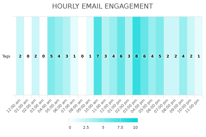
 Hourly Email Engagement
Similar to the report above, the Hourly Email Engagement report shows the best time of the day to send emails to your specific list. The data is broken down into one hour increments to show when you get the most activity on your emails.
 Daily & Hourly Email Engagement
This report gets super granular by displaying the best combinations of days and times to send emails to your specific list. Now you can truly adjust the timers in your campaign sequences in order to send the right message, to the right audience at the right time. More opens, more clicks, more money. It’s just that easy.
This is a pretty exciting update, but it’s only the beginning. We’ve already mapped out the next few Keap campaign builder reports we want to build. So keep your eyes open for our next update. And the one after that. And probably the one after that 😉
I won’t keep you any longer, you’ve got some reports to configure…
Happy Charting!
Team Graphly
P.S. How will these reports help you? What Keap campaign builder reports do you want to see? Let us know in the comments below!
P.P.S. Here’s a sneak peak at one of the reports that shows the best time of day to send emails (for the specific list that’s being sampled) – in this case 10 AM or 3 PM.