
We often see dashboards that utilize the same report template with varying criteria per report for multiple side-by-side reports. The most common instance of this occurs when managers are attempting to compare the performance of sales reps to each other.
Comparing Opportunity Stats
The Problem
The problem with this approach is that like most other reporting tools, Graphly autoscales the y-axis to display the largest/most visible columns, bars or lines possible based on the maximum data point in the range. Since each sales rep has a unique maximum data point in his or her range, you end up with multiple charts that have varying values along the y-axis. The end result: you may look at Rep A’s chart that has a maximum of 80 and Rep B’s chart that has a maximum of 40 – and the two pictures may look similar in size. At a glance you conclude that the two sales reps are performing at a similar level when in reality, Rep A is achieving 2x the results of Rep B.
The Solution
Sure you could slow down and pay close attention to the range of the y-axis, but there is a bit of work involved in seeing the disparity and calculating the difference. But doesn’t that somewhat defeat the purpose of a dashboard designed to give you quick, simple insights that you can take action on? We thought so, and that’s why we decided to head down the path of creating “_______ by Rep” reports that chart multiple sales reps (opportunity owners) on the same chart.
This approach eliminates any discrepancy in comparing opportunity stats of one sales rep to stats of another sales rep by keeping them on one chart, utilizing the same y-axis scale. It also saves a lot of real estate on your dashboard because you can now use just one report that would have previously required you to create one for each sales rep you wish to compare.
Opportunity Pipeline by Rep
Today we’re releasing a new report, Opportunity Pipeline by Rep, which is the first of many reports designed to allow managers to compare the performance of sales reps against each other.
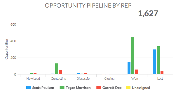
This report allows you to see exactly where opportunities currently are in the sales process for each of your sales reps. Instantly take note of a rep who has a bunch of new leads (no contact attempt made) or a rep who has a bottle neck with closing. You may just find that some sales reps are great at developing leads and others are great closers. From there, you can adjust your processes or training accordingly to help each team member be reach their full potential.
Compare Opportunity Stages
This new report was suggested to us by a Graphly user at ICON. There are many different ways to configure and use this report. Below you’ll see a couple of options.
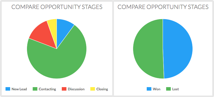
We believe a popular use will be determining your true Win/Loss ratio. Once you’ve taken a prospect through your entire sales process and get down to a definitive “yes” or “no”, and you disposition the opportunity record accordingly, what percentage of opportunities do you win? In other words, what’s your close rate?
Now some seasoned users might be asking, “well what about the Opportunity Funnel? Doesn’t that show rates and percentages?” Yes, it does, but it’s taking into account opportunities that are still being worked and haven’t either:
- Purchased
- Given a Definitive No
The report above allows you to exclude working stages. Not to mention, won/lost stages are both the final outcome and are not sequential in nature.
What’s Next?
We’ve got more sales reports in the hopper, so stay tuned! In the meantime, log in now to set up these new reports.