After being live for a year and amassing a user base we’re certainly proud of, we began to experience a few performance issues. Widget load times lulled for certain users. The sync frequency with Keap wasn’t able to keep up on a small number of accounts. We kept maxing out CPU despite increasing the number of servers and the size of those servers.
Nothing was a show stopper for any of our users, but we knew these items could turn into show stoppers if we didn’t resolve the issues early on. We handle a lot of data and we’ll soon be handling significantly more data as we look to possibly double the data we report on and multiply the customers we’re currently serving by 50x. More on that in a later post.
The short of it is that we decided to pause the development of additional reports in order to focus on improving our system architecture. This will ensure a better user experience for everyone. If you’ve logged into Graphly the last week, and you’re someone who notices things like load times, you probably experienced a tighter, much snappier experience as you moved through the app. Syncs are simply harmonious now and we’re far more prepared to scale our app in line with (even ahead of) our projected growth.
I realize that back-end updates aren’t all that impressive to those who only see the front-end. That’s why after completing our back-end updates, we cranked on a few reports you’d be able to enjoy on the front-end. And here they are (click the image or title to view the article):
 Email List Health
We’ve all heard renowned business advisors say, “the money is in the list.” They often place the highest priority on continually increasing the list size but all too often disregard the health of that list. This report gives you valuable insights as to the health and marketability of your list. After all, the money is in a healthy list.
 Compare Tags
Despite having 8 tag reports to date, as well as being able to filter almost any of the other reports in our template library by tag criteria, we were still receiving requests to measure tags in a different way. Now you can select tags and compare them to each other or to the entire list, in pie format, with percentages.
 Text Area Widget
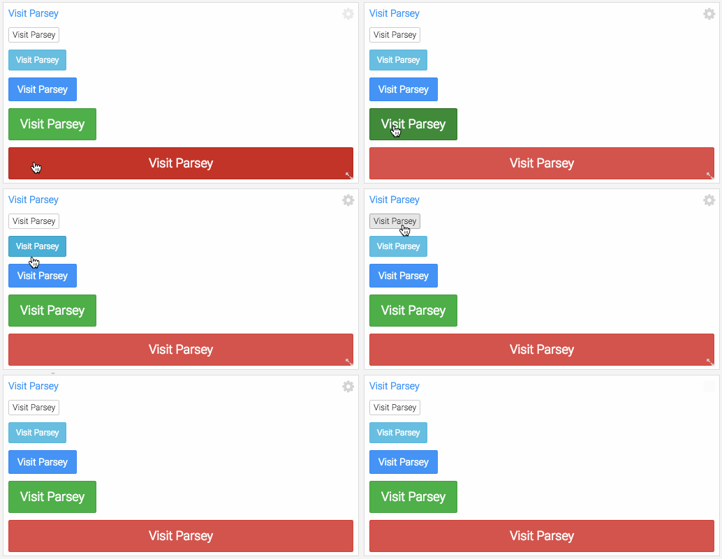
This report template is the answer to numerous user requests to add images/logos, notes/memos, links/buttons and more to their dashboards. We’ve put together a handful of examples for this widget and are excited to see the creative uses our users come up with.
Do you have a creative use for the new text area widget? Want to share it with the Graphly community? Send us the name of your account and dashboard that contains the widget for a chance to be featured in the future. Or, post it in our private facebook group.
More to come soon!
Happy Charting,
Team Graphly
