Graphly has over 100 reports to choose from. This short guide will give you a brief introduction to adding a new report to your dashboard.
Template Library
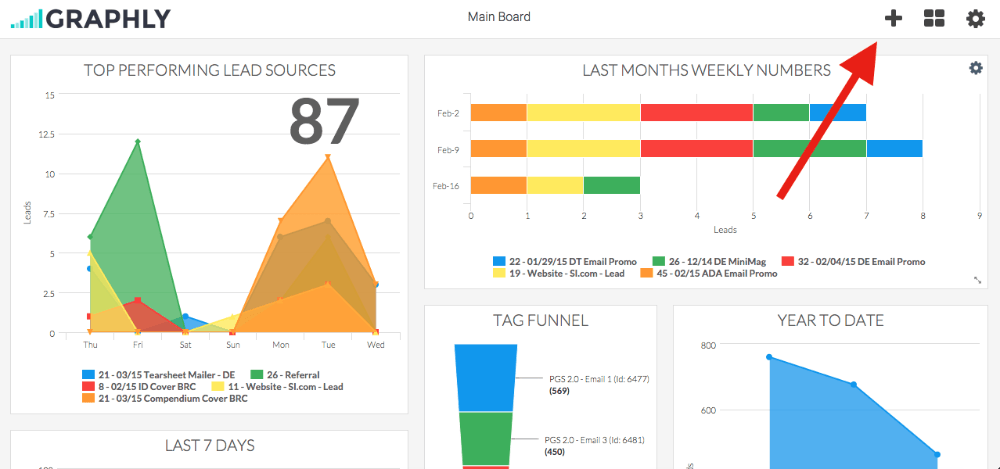
To add a report select the “+” symbol in the top right corner.
In the graph menu screen you get the option to choose all the graphs we currently have available. We are adding new graphs all the time. You also have the option to filter the graphs by category.
Choose a Category (Optional)

Display Tab
You now have the option to customize how you will see the data. Select the type of graph you want.

Settings Tab
You can customize more by selecting Settings. For this report you can select how many lead sources you want to see, and set the date range for the data.

Filters Tab
For ultimate control and customization, you can use the Filters tab to add additional restrictions on the data.

Relevant Articles
- How to Add Another Keap Application to Graphly
- How to view Graphly inside your Keap account
- How to Add Users to your Graphly Account
Try Graphly for Just $1!
Unlock the full potential of your data with Graphly! Sign up for our 14-day trial for only $1 and gain access to a wide range of powerful reports designed to help you make data-driven decisions. Here are some of the reports you can explore:
- Opportunity Leaderboard: Track and analyze your team’s performance.
- Gross Revenue: See the money coming into your Keap account over time.
- Opportunity Forecast: Forecast the adjusted revenue of active opportunities based on the stage probability.
- Units Sold: See the number of units sold for each product you select over a given date range.
- Campaign Email Stats: Measure the impact and conversion of your marketing campaigns.
- Tags Applied: See how many tags get applied to contacts during a period of time.
Don’t miss out on this limited-time offer! Start Your 14-Day $1 Trial Now.