So you bought Keap, or better yet, Keap. You have a sweet landing page for your webinar and you’ve created some sweet marketing automation that sends a few emails and text messages at each stage of your funnel.
Your marketing must be crushing it, right?

It’s hard to know unless you have detailed reporting
Creating effective reporting for your marketing efforts can be tricky, especially for Keap and Keap users. You likely have multiple lead gen campaigns using various ebooks, webinars, and other tools as a way to get prospects into your funnel. Once they enter your funnel, you likely have countless emails and SMS campaigns that are being a/b tested to ensure you get maximum results.
What I’m trying to say is that you probably have a crap ton of moving parts in your Keap or Keap application. How are you supposed to know how each element is performing?
To make matters worse, Keap’s reporting is, well, lacking to say the least. Yes, they have a dashboard tool where you can add a few generic widgets or create a counter widget that is based on a custom report or saved search, but that isn’t going to provide real-time data in an effective way.
What you need is a visual dashboard that allows you to see how successful your marketing is doing for all stages of the funnel. This will allow you to know where to properly invest future marketing dollars.
Graphly is a simple tool that allows you to create visual, custom dashboards for all the activity happening inside of your Keap or Keap application. We’ll walk you step-by-step on some powerful visual dashboards Graphly can help you create to measure your marketing campaigns. Check this article on creating detailed sales and sales pipeline reports for your Keap or Keap application.
Custom Tag-Based Marketing Reports
One of the best ways to create custom reports for your marketing campaigns is by using tags. Keap and Keap are built around tags. You use them for starting and stopping automation, segmenting customers, and just about any other thing you can think of.
A properly organized application has a system of adding and removing tags. Done properly, you can create powerful, dynamic reports for every email or automated marketing campaign. We aren’t going to dive deep into how to create your tagging system in this article, but there are many companies that can show you how to do that.
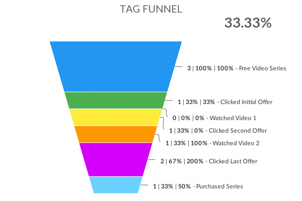
Tag Funnel
One of the best ways to measure your marketing efforts is by creating a marketing funnel using tags.
If you aren’t familiar with the concept of a marketing funnel, consider the shape of a funnel you might use to add oil to your car. The top is wide to catch all the oil, but the bottom is narrow. Your marketing funnel looks the same. The top is wide, which represents the wide net you cast to collect as many leads as possible. Along your marketing, many people lose interest in your company or product and leave the funnel. For those that don’t, they exit the bottom of the funnel as a customer.
The purpose of creating a tag-based funnel report is to find which area of the funnel is causing you to lose your customers. This way you can grow your sales by simply optimizing your funnel instead of investing more into adding people to the top of your funnel. For this to work well, you’ll need to properly apply and remove the right tags at each step of the funnel so that you can know exactly what customers are in what specific stage.
The Tag Funnel report template allows you to visual each step of the funnel you created using tags. Simply configure the report by selecting tag(s) to represent each step and you’ll have a visual, custom dashboard report showing you how well your marketing funnel is performing.
If you use Chrome or Firefox, you can even add this visual dashboard to your Keap application so that you don’t need to log in to a seperate site to see your reports. Click here for more information on adding your dashboard within your app.
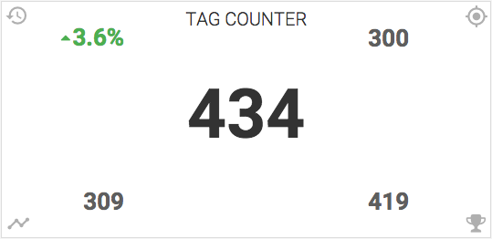
Tag Counter/ Tag Goals
If you don’t want a full funnel report but want to know how well your marketing is doing based on tags, you can use one of these simple reports. This is a great way to see how many people have downloaded your ebook, clicked your email offer, visited a landing page, or watched a webinar. The best report for you is going to depend on your individual needs and use-case.
The Tag Counter report will give you a current snapshot of tags that meet certain criteria. In addition to showing how many tags are applied, it will also compare the current performance over a previous cycle, display your goal, average performance, and best performance.
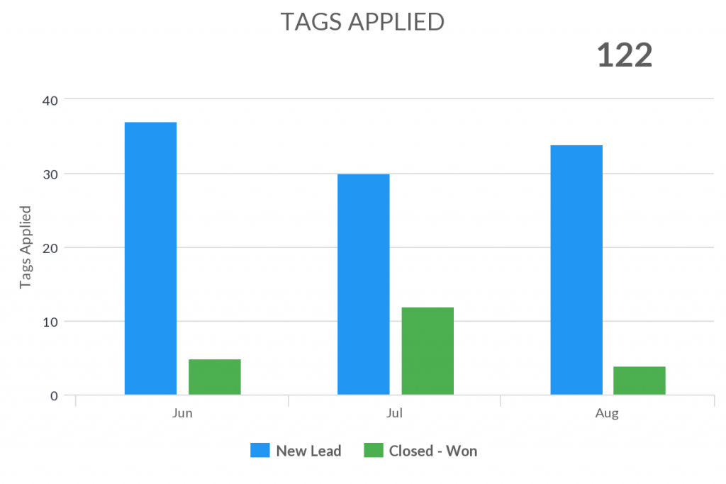
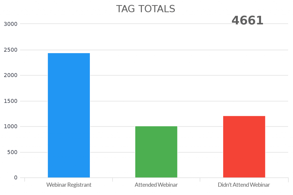
To have a comparison over the number of times tags have been applied over a given amount of time, use the Tags Applied report template. If you only want to show the total amount of tags, regardless of time period, use the Total Tags report template.
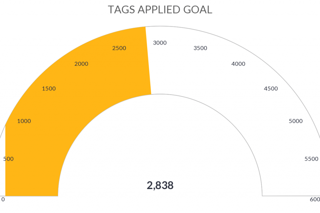
The Tags Applied Goal is very similar to the Tags Applied template. However, this report will show you how many tags have been applied over a given period of time and compare that to a goal that you can set within the template configuration.
Lastly, let’s chat about the Compare Tags report. This is a good way to compare a/b test results, compare which upsells are purchased the most, or compare the effectiveness of individual emails within your onboarding series. This report is a pie chart that gives you the usage percentage of each tag you add to the template.
Days Between Tags
Another effective way to use tags on reporting is by measuring how long it takes for a contact to get a tag after another is applied. This is a great way to measure how long it takes for contacts to pass from one stage of your marketing funnel to another. It’s also a great way to measure how long it takes your sales team to move them from one stage of the sales pipeline to another if you aren’t using the built-in opportunity pipeline.
The Days Between Tags report will tell you the average time it takes as well as a detailed breakdown of the number of contacts for each day.
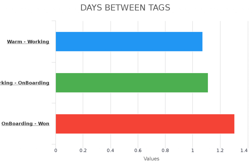
Note: This template relies on historical tags, which are tags that show a contacts engagement history and should never be removed. This is not to be used with current status tags, which are applied and then removed after a contact passes to another part of the funnel.
Value/Lead by Tags
Have you ever wanted to show the average value per lead that enters your marketing campaign? Without knowing the average value per lead or value per customer, how are you going to know how much money you can spend on your ad campaign? Graphly’s Value/Lead by Tags report template makes it easy to calculate this figure based on specific tags you want to filter your report by.

Attribute UTM data to Tags
Keap has a built-in lead source tracking tool, but it’s very difficult to use and rarely accurate. But what if you want to attribute your marketing campaign back to the actual lead source? Not only can Graphly do that, but it can even attribute a particular lead source to a specific tag using UTM parameters. You can do that using the Top Tag Attribution report template. This report can help you measure what source is driving the most lead magnet downloads, increasing webinar registrations, or product demonstrations.
This report template is very powerful for people that are running multiple ad campaigns to the same landing page.
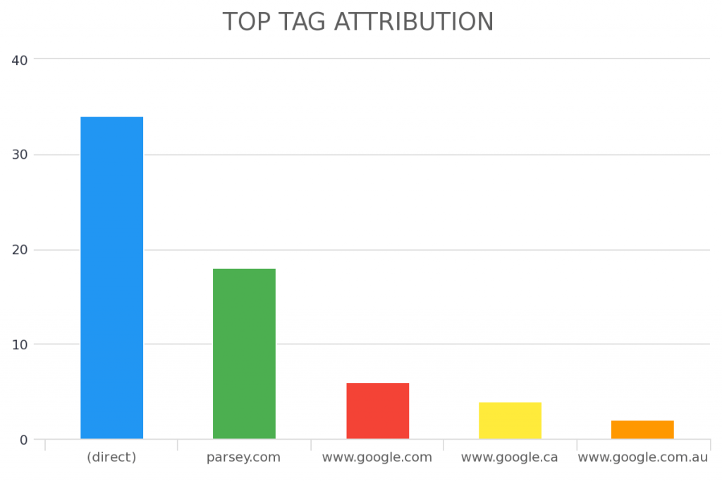
NOTE: You must be using Graphly’s Web Tracker and properly using UTM params on all your landing pages and links for this report to work.
Email Marketing
Despite what many people have been claiming for years, email is not dead. In fact, email marketing is just as relevant today as it has ever been. In early 2020, Hubspot reported that that email has a 3,800% return on investment. How many marketing tactics do you have that give you $38 for every $1 you invest?
Despite the high potential ROI, email marketing needs to be monitored and tested just like every other effective marketing initiative. You don’t get a 3,800% return by sending a simple email out to your cold list. Effective email marketing takes strategy. We don’t dive into those strategies today, but we can talk to you about how to measure whether or not your strategies are working.
Here are some ways you can create custom reports to show how effective your marketing campaigns are so that you can put the right energy into updating them.
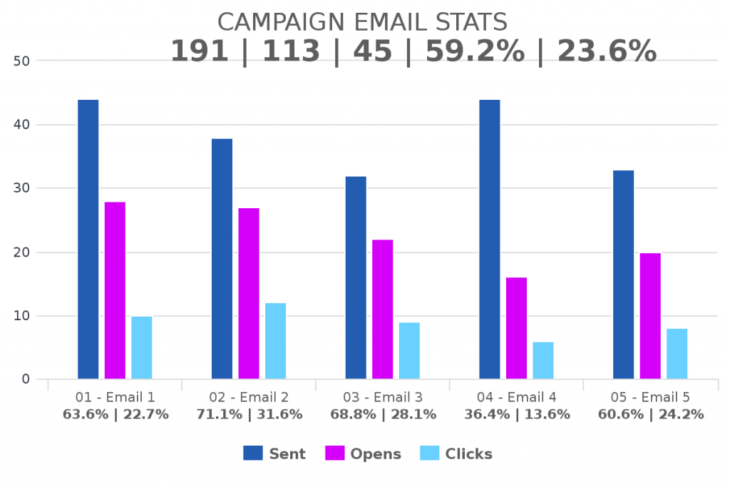
Campaign Email Stats
Keap campaigns can become very complex, very quickly. If you have 25 emails, knowing how each one is performing can take some time. You’ll need to go into the individual campaign and query the stats to show that data. Plus those stats only show opens and clicks, not conversions.
The Campaign Email Stats marketing report will help you see all of the relevant email stats, including conversions, happening inside of your campaign. Create a new report for each campaign and you can see the stats for all of your campaigns on a single screen. If you do a significant amount of email marketing inside of Keap, this may be your favorite report out of our 160+ templates.
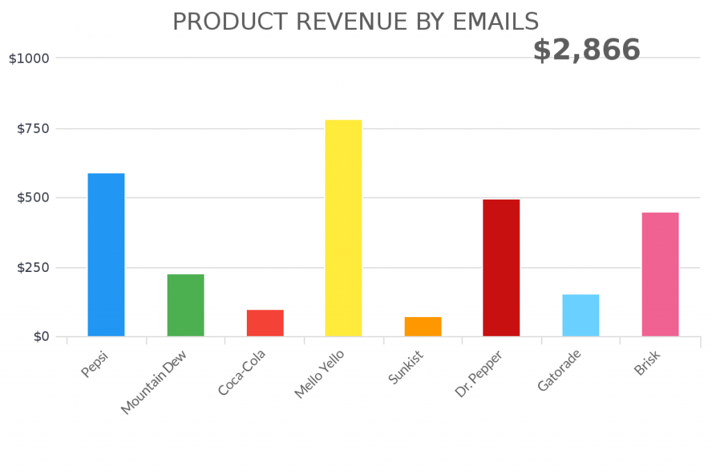
Revenue from Emails
As we mentioned earlier, nobody sends emails just to see the open and click rate. The end goal should be driving revenue to your company. Graphly can help you see which emails are driving the most revenue to your business (and which emails are not driving any revenue). This is important. Without this data, you don’t know which emails need optimizing. To see this data, add the Revenue from Emails report template to your Graphly dashboard.
Tag Counter/Tag Goals
We already discussed the Tag Counter, Tags Applied, and Tag Applied Goals reports above, but it’s important to remember that these templates are universal and a great way to measure how effective your email campaigns are working. These templates are also great if you are using a tool like FixYourFunnel for SMS marketing.
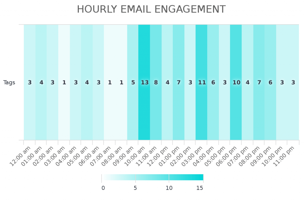
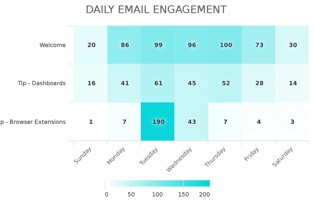
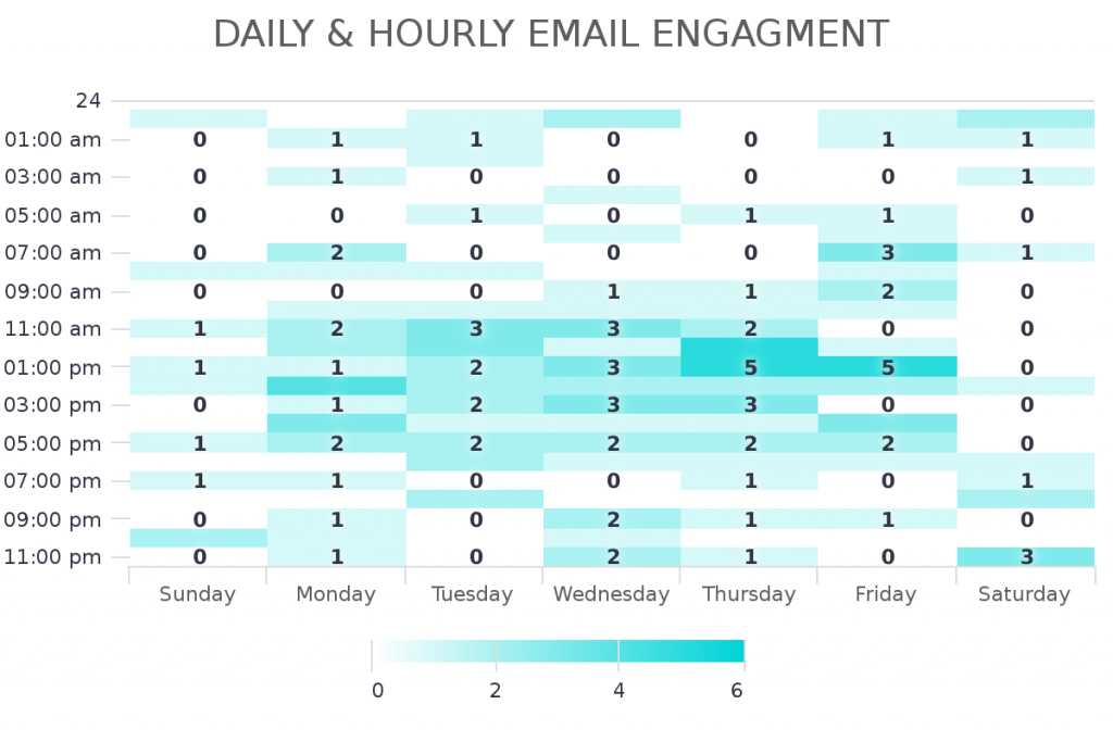
Email Engagement Reporting
Another set of reports to consider using is are the email engagement reports. These reports will show you the hour and day of the week that your leads and customers are engaging with your email. One study may show that it’s best to send emails on Monday, but never on Saturday. Another might say that Monday’s are full of email spam and to only email your list on Wednesday. But how do you really know? By measuring when your list is opening your emails.
There are a few ways to do this. First, use the Hourly Email Engagement, Daily Email Engagement, or Daily & Hourly Email Engagement report templates. This will show you the best time to send emails based on people engaging with your emails.
Another way to do it is by using the tag engagement reports. These reports look similar to the email engagement reports but are based on when a contact is applied to a tag. These are a great way to customize the way you measure your email engagement, but it does require more backend setup within your campaign. To measure it using tags, you must have the right tags firing at the right time.
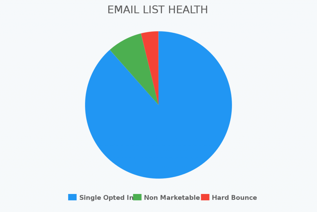
Email List Health
Lastly, you want to keep an eye on your email list health. You can do most of this inside of Keap’s native reports, but if you don’t want to set a reminder to check it once a month and then follow the process to actually running the manual report, simply throw this Email List Health report template on your marketing dashboard for instant, visual feedback of your email list health.
Lead Reports
What about all the leads coming into your Keap application? Are they converting or going cold? Which leads convert teh best? Which generates the most revenue? These are essential questions for any business that is serious about improving their marketing.
Graphly can help you hone in on the data you need to make better decisions with giving you real-time inside into your leads.
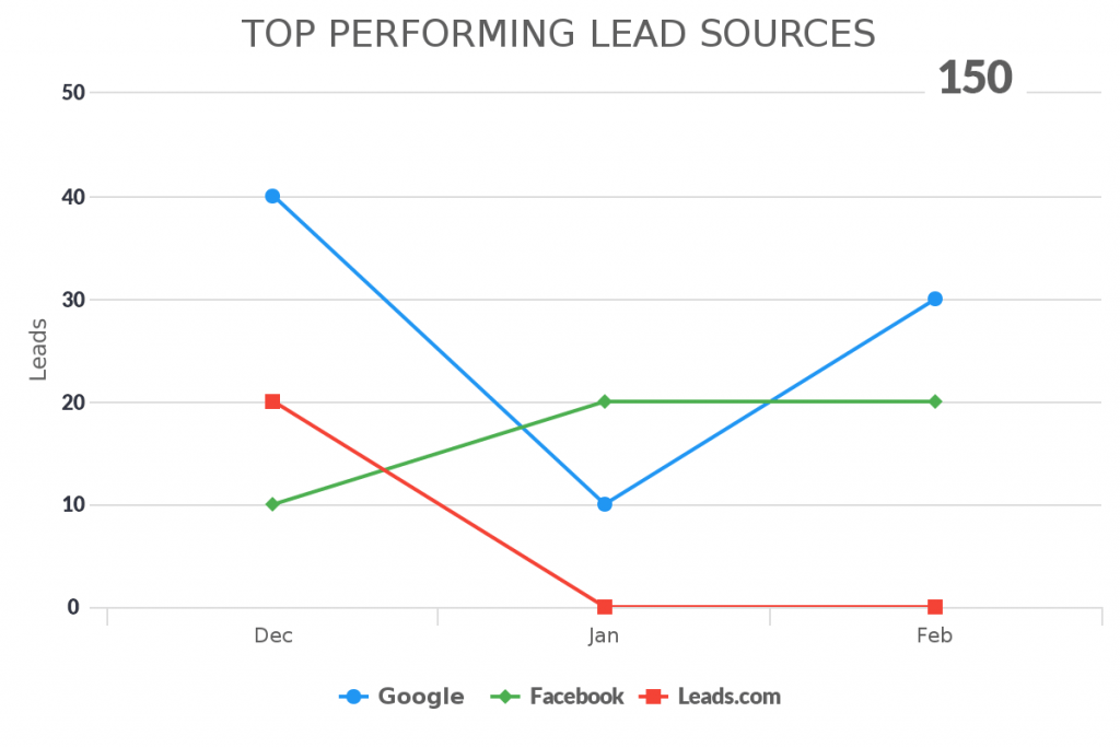
Top Performing Lead Sources
One important lead report you can see inside of your Keap account is which lead sources are performing the best. That way you can stop throwing money into a lead source that isn’t producing revenue or invest some time to see how it can be improved.
Use the Top Performing Lead Sources to help pinpoint your best (and worst) lead sources.
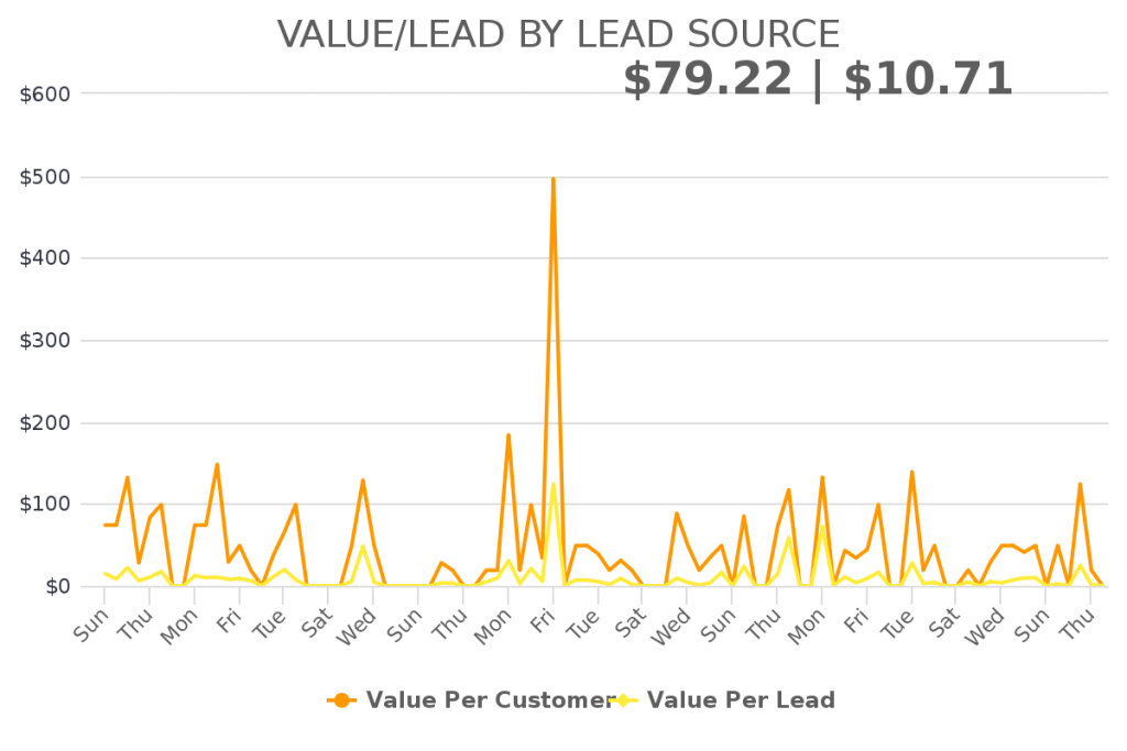
Value / Lead by Lead Source
Knowing the top lead source is good, but knowing how much the average lead that comes from the lead source is even better. The Value/Lead by Lead Source is a report template that can help you see the average value of a lead that is brought in by a particular lead source.
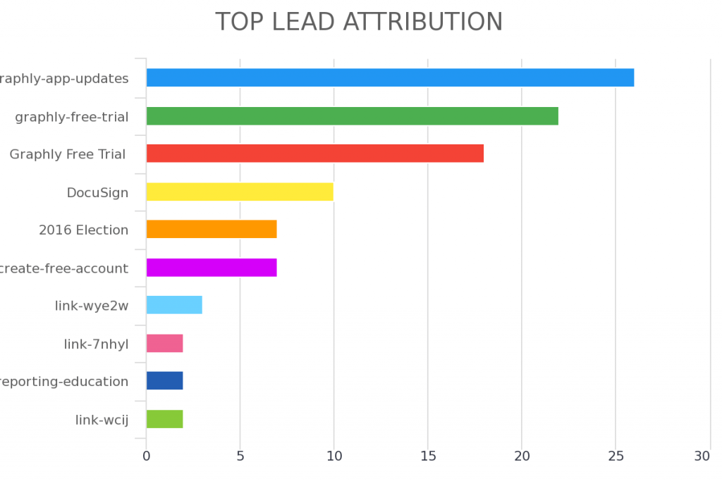
Top Lead Attribution
The Top Lead Attribution report works similarly to the Top Tag Attribution. If you are currently using UTM parameters on your landing pages, you can pass that information to the lead source inside of your Keap account. This is a great report for marketers that use UTM params to know the exact source of their traffic.
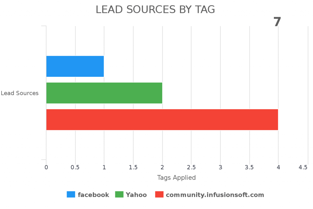
Lead Sources by Tag/Product
If you are using tags to track every engagement a contact has with your marketing, you may want to know what lead source is causing your tags to be fired. Lead Sources by Tag/Product is a great report. This is helpful if you have purchase goals that are being triggered outside of Keap’s native e-commerce portal and want to know where those purchases are coming from.
Site Reporting
Website tracking last section we are going to cover in this article on marketing reports. You may be wondering, why would I want Graphly to track my web traffic when Google analytics already does that for me?
Google Analytics is a phenomenal tool and is used by millions of websites, including ours. However, there is one thing that Google Analytics can’t do: show your analytics within your Keap account.
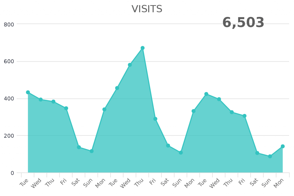
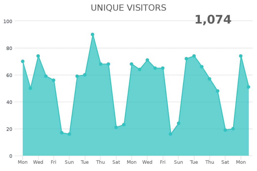
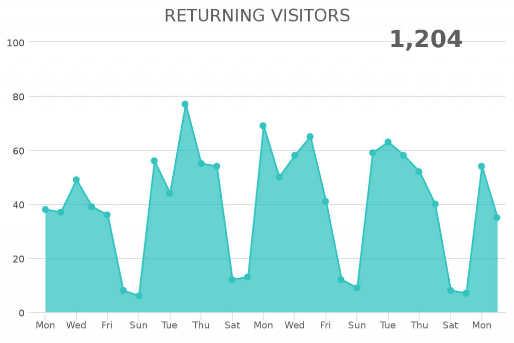
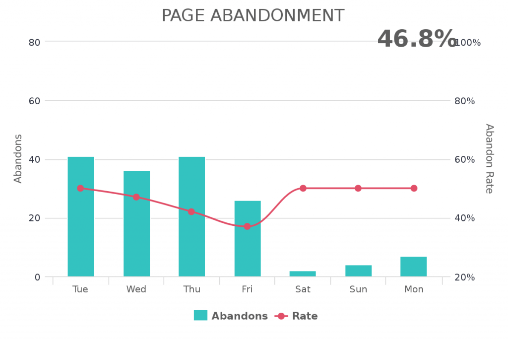
Standard Page Analytics
Graphly give you the same standard page analytics that you normally see within other site analytics tools. These reports include page visitors, pages per visit, unique visitors, returning visitors, and page abandonment (bounce). All of these report templates can be customized for a specific time period
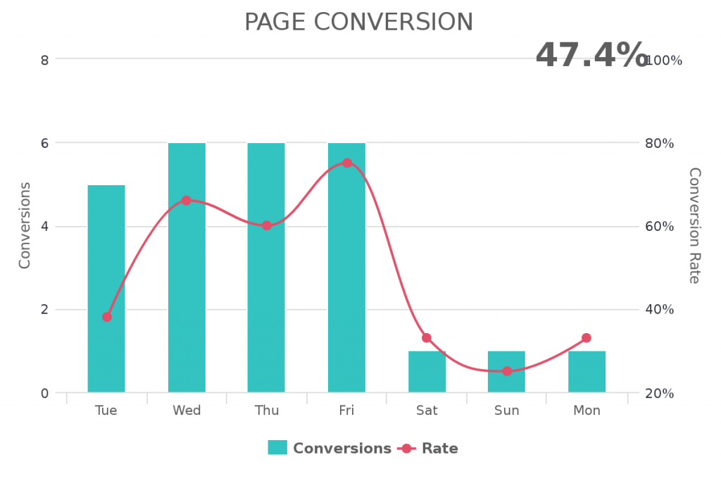
Page Conversion Rate
One report that many Keap and Keap customers find very helpful is the Page Conversion Report. This report makes it very easy to configure the conversion rate of a specific landing page, one click upsell page, or any other type of page on your website. Simply enter the page you want to measure the conversion rate for and then enter the page used to trigger a conversion (ex: thank you page).