The Appointment Note Task by User template displays the appointments, notes, and tasks that have been completed by each user during a given date range. Allowing you to compare the efforts of one user to another user. This is perfect for sales teams with call quotas or customer service teams where individual reps are assigned fulfilment tasks.
Search for the Appointment Note Task by User Template
To begin, click the “+” icon on your dashboard and type “Appt” into the search bar. Then select the Appt|Note|Task By User Template.
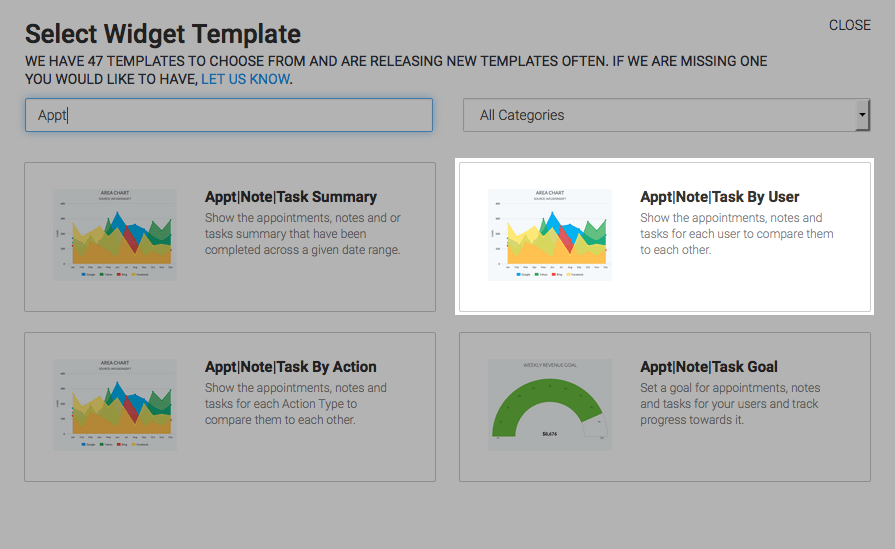
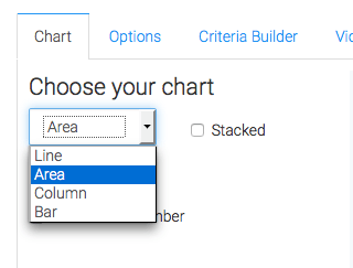
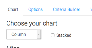
Chart Tab
There are four options available to you for the chart type. All will work, but since you are comparing users side-by-side, I prefer to use the Column chart and not stack the results. Stacking can make it a little more challenging to clearly see leaders and last-placers. On the flip side, it does nicely total all users together for each interval that is displayed.
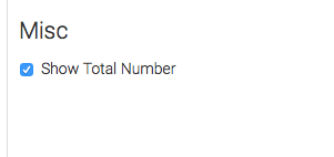
Lastly, check the “Show Total Number” box so that you can see that value in the top right-hand corner of the graph.
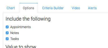
Options Tab
Navigate over to the Options tab. First select the type of records you want to include in the report. I’ll check Appointments, Notes, and Tasks.
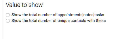
Next, select the Value to Show. Choose the first option to show the total number of Appointments, Notes, or Tasks. Choose the second Option to show the total number of unique contacts with these.
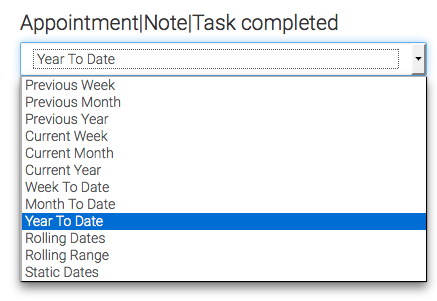
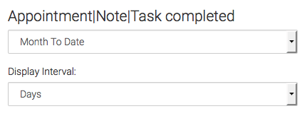
Now set the date range that you’ll want to look at. I’ll select Month to Date and break it down into Days.
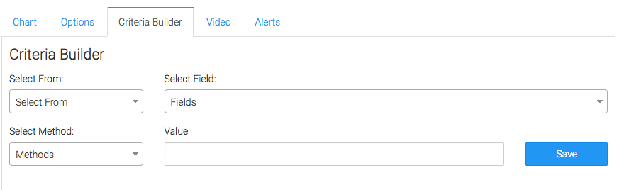
Criteria Builder Tab
For ultimate control and customization, use the Criteria Builder to include additional rules and requirements to the report.
Once you have that set, click Save Preferences on This Widget.
Relevant Articles
- How to Set Up the Appointments, Notes Tasks Summary Report
- How to Set Up the Appointment Note Task Goal Report
- How to Set Up the Appt|Note|Task by Action Report
Try Graphly for Just $1!
Unlock the full potential of your data with Graphly! Sign up for our 14-day trial for only $1 and gain access to a wide range of powerful reports designed to help you make data-driven decisions. Here are some of the reports you can explore:
- Opportunity Leaderboard: Track and analyze your team’s performance.
- Gross Revenue: See the money coming into your Keap account over time.
- Opportunity Forecast: Forecast the adjusted revenue of active opportunities based on the stage probability.
- Units Sold: See the number of units sold for each product you select over a given date range.
- Campaign Email Stats: Measure the impact and conversion of your marketing campaigns.
- Tags Applied: See how many tags get applied to contacts during a period of time.
Don’t miss out on this limited-time offer! Start Your 14-Day $1 Trial Now.