The Email Service Provider Breakdown template shows the distribution of leading email domains in your database.
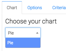
Chart Tab
From the chart tab you’ll see the email service provider breakdown report is displayed as a pie chart.
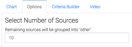
Options Tab
Now let’s head to the Options tab.
Email Service Provider Number
First we will select the number of sources (a number between 5 and 10 usually suffices).
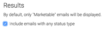
By default this will only take into account email statuses that are considered ‘Marketable’. If you want to include all of the emails, click this box.
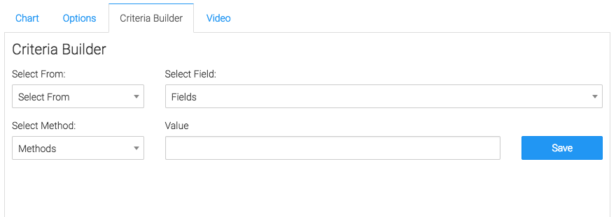
Criteria Builder Tab
For ultimate control and customization use the Criteria Builder tab.
Relevant Articles to Email Service Provider Breakdown
- How to Set Up the Email Engagement Rate By Provider Report
- Setting Up Email Reporting in Keap’s Campaign Builder
- How to set up Keap URL’s for Graphly’s Web Tracker
Try Graphly for Just $1!
Unlock the full potential of your data with Graphly! Sign up for our 14-day trial for only $1 and gain access to a wide range of powerful reports designed to help you make data-driven decisions. Here are some of the reports you can explore:
- Opportunity Leaderboard: Track and analyze your team’s performance.
- Gross Revenue: See the money coming into your Keap account over time.
- Opportunity Forecast: Forecast the adjusted revenue of active opportunities based on the stage probability.
- Units Sold: See the number of units sold for each product you select over a given date range.
- Campaign Email Stats: Measure the impact and conversion of your marketing campaigns.
- Tags Applied: See how many tags get applied to contacts during a period of time.
Don’t miss out on this limited-time offer! Start Your 14-Day $1 Trial Now.