This template shows the days of the week that a particular tag, or a group of tags are applied. Or in other words, this template displays the tag activity by days.
Display Tab
The only chart type for this report is a Heatmap. A darker section of the heat map shows more tags being applied, and a lighter section of the heat map shows less tags being applied.

Settings Tab
Now navigate to the Settings tab to add which tags to track.

Next, decide whether you want to group your results together or see a unique row of data for each tag. To compare tags instead of combining them, make sure to select the Separate Tags Total Checkbox.

Next, select the date range you wish to measure.

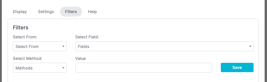
Filters Tab
For ultimate control and customization, use Filters to include additional rules and requirements for the report. Using this, you can filter results by any field on the contact record.
Relevent Articles
Try Graphly for Just $1!
Unlock the full potential of your data with Graphly! Sign up for our 14-day trial for only $1 and gain access to a wide range of powerful reports designed to help you make data-driven decisions. Here are some of the reports you can explore:
- Opportunity Leaderboard: Track and analyze your team’s performance.
- Gross Revenue: See the money coming into your Keap account over time.
- Opportunity Forecast: Forecast the adjusted revenue of active opportunities based on the stage probability.
- Units Sold: See the number of units sold for each product you select over a given date range.
- Campaign Email Stats: Measure the impact and conversion of your marketing campaigns.
- Tags Applied: See how many tags get applied to contacts during a period of time.
Don’t miss out on this limited-time offer! Start Your 14-Day $1 Trial Now.