The Email List Health template shows you the overall health and marketability of your email list.
Search for the Email List Health Template
To begin, click the “+” icon on the Dashboard and type “health” into the search bar. Then select the “Email List Health” template.
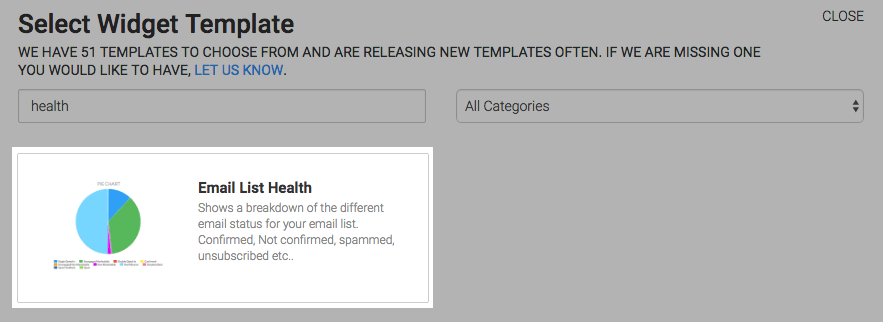
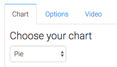
Chart Tab
There is only one option for the chart type, which is pie.
Options Tab
Navigate to the Options tab and select your comparison type. The first four options will always result in a pie chart with two slices.
- Marketable VS Unmarketable helps you identify what percentage of your list you can reach via email versus those you can’t.
- Engaged VS Unengaged shows you who is opening and clicking versus those who aren’t.
- Confirmed VS Unconfirmed gives you insight on how well you’re doing on getting subscribers to confirm.
- Spam VS Unsubscribed gives insight into the mood and behavior of your subscribers at the time that they depart your list.
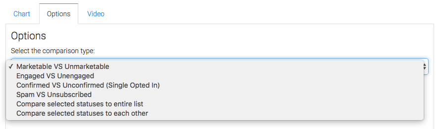
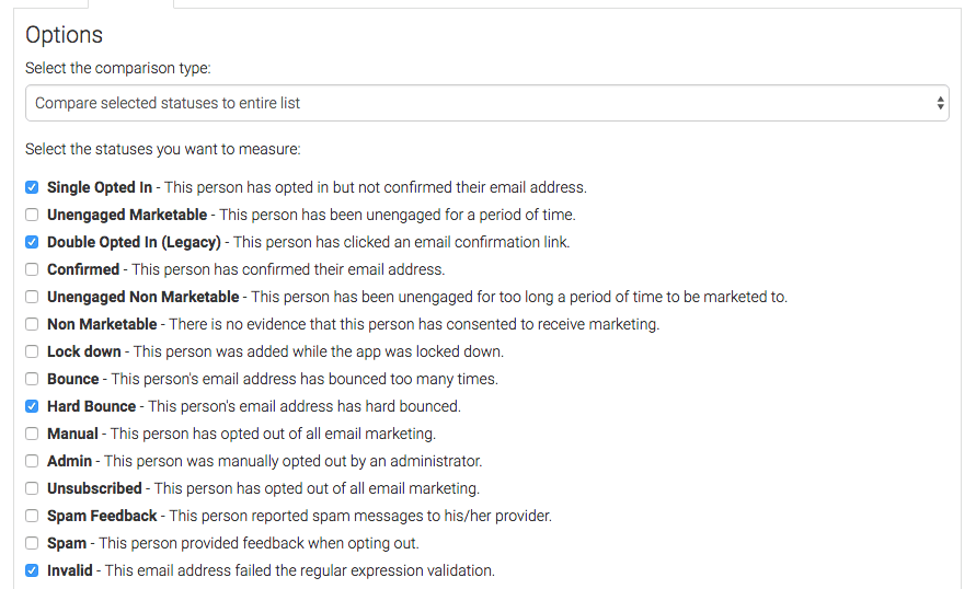
The next two options allow you to individually select email statuses we want to compare.
The first of these two options will group those selected statuses and compare them against all other email statuses.
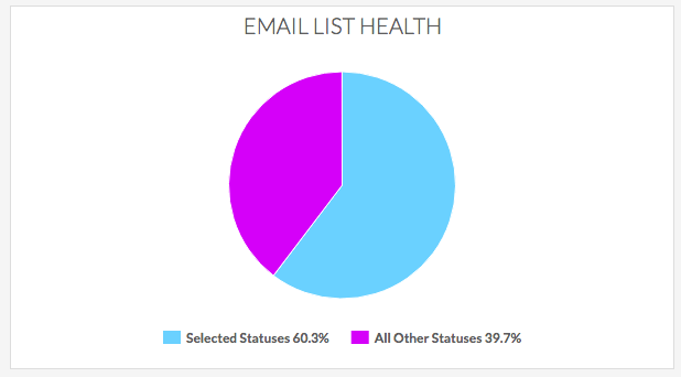
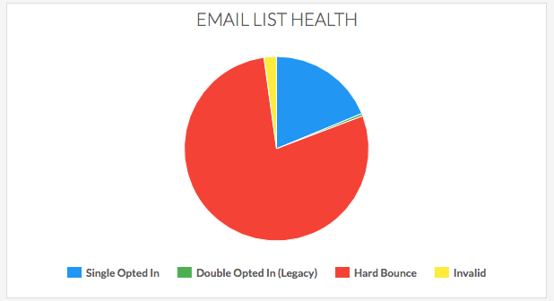
The second of the two will compare selected statuses to each other.
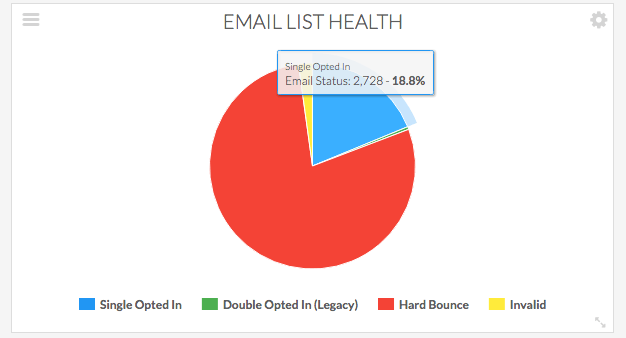
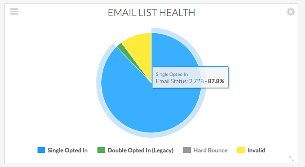
Hovering over slices will give you a percentage of the pie and the number of contacts with that status.
You can also deselect the statuses in the legend.
If you wish to see the contacts that represent a status you can click on the slice of pie with that status to see the details.
Relevant Articles
- How to Set Up the Email Service Provider Breakdown Report
- How to Set Up the Email Engagement Rate By Provider Report
- How to Set Up the Email Engagement Report
Try Graphly for Just $1!
Unlock the full potential of your data with Graphly! Sign up for our 14-day trial for only $1 and gain access to a wide range of powerful reports designed to help you make data-driven decisions. Here are some of the reports you can explore:
- Opportunity Leaderboard: Track and analyze your team’s performance.
- Gross Revenue: See the money coming into your Keap account over time.
- Opportunity Forecast: Forecast the adjusted revenue of active opportunities based on the stage probability.
- Units Sold: See the number of units sold for each product you select over a given date range.
- Campaign Email Stats: Measure the impact and conversion of your marketing campaigns.
- Tags Applied: See how many tags get applied to contacts during a period of time.
Don’t miss out on this limited-time offer! Start Your 14-Day $1 Trial Now.