The Contact Leaderboard template shows the leaderboard sorted by field values stored on the contact record.
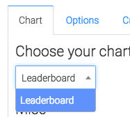
Chart Tab for the Contact Leaderboard Report
From the chart tab you’ll see this chart type is Leaderboard.
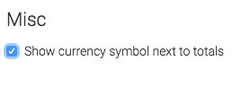
We can choose whether or not to show the currency symbol next to the totals.
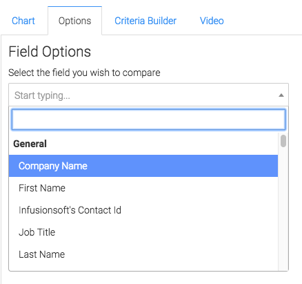
Options Tab
Now let’s go to the Options tab.
Now select the field you want to compare.
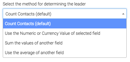
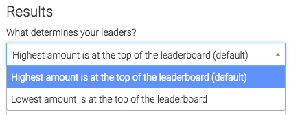
Then, we select the method for determining the leader.
Then we choose whether a high value or a low value should be shown at the top.
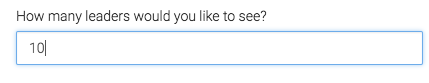
Then we select how many numbers we want returned.
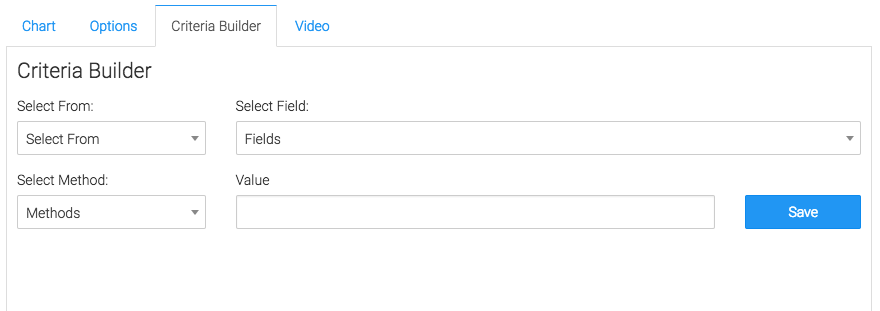
Criteria Builder Tab
For ultimate control and customization, use the criteria builder.
Relevant Articles to Contact Leaderboard
- How to Set Up the Tag Leaderboard Report
- How to Set Up the Contact Counter Report
- How to Set Up the Hourly Tag Activity Report
Try Graphly for Just $1!
Unlock the full potential of your data with Graphly! Sign up for our 14-day trial for only $1 and gain access to a wide range of powerful reports designed to help you make data-driven decisions. Here are some of the reports you can explore:
- Opportunity Leaderboard: Track and analyze your team’s performance.
- Gross Revenue: See the money coming into your Keap account over time.
- Opportunity Forecast: Forecast the adjusted revenue of active opportunities based on the stage probability.
- Units Sold: See the number of units sold for each product you select over a given date range.
- Campaign Email Stats: Measure the impact and conversion of your marketing campaigns.
- Tags Applied: See how many tags get applied to contacts during a period of time.
Don’t miss out on this limited-time offer! Start Your 14-Day $1 Trial Now.