This report gives you the ability to focus on the Revenue by stage, or the count of opportunities in each stage, aka your opportunity pipeline summary.
Display Tab
First, select your chart type. You can choose from either Column or Bar.

Settings Tab
Next, click on the Settings Tab. Here is where you decide whether you want to show the number of Opportunities in each stage or the revenue total for each stage. It’s important to note that there is value in going through this process twice so that you have a widget providing a count of opportunities, and a separate widget providing the revenue number for those same opportunities. I’ll choose Show revenue totals for each stage so I can demonstrate the additional option; Which is to define how you want Graphly to calculate revenue.

You can base revenue on the Projected High or Low, Use the Average between the High and Low, or use an Opportunity Custom Field where you are storing a value.

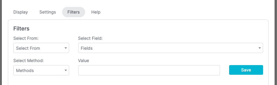
Filters Tab
For ultimate control and customization, use Filters to create additional rules and requirements to the report.
Relevant Articles
- Opportunity Pipeline by Rep
- How to Configure the Pipeline Digression Report
- How to Set Up the Opportunity Funnel Report
Try Graphly for Just $1!
Unlock the full potential of your data with Graphly! Sign up for our 14-day trial for only $1 and gain access to a wide range of powerful reports designed to help you make data-driven decisions. Here are some of the reports you can explore:
- Opportunity Leaderboard: Track and analyze your team’s performance.
- Gross Revenue: See the money coming into your Keap account over time.
- Opportunity Forecast: Forecast the adjusted revenue of active opportunities based on the stage probability.
- Units Sold: See the number of units sold for each product you select over a given date range.
- Campaign Email Stats: Measure the impact and conversion of your marketing campaigns.
- Tags Applied: See how many tags get applied to contacts during a period of time.
Don’t miss out on this limited-time offer! Start Your 14-Day $1 Trial Now.