The Compare Opportunity Stages template shows the number of opportunities in each selected stage to each other or against the unselected stages.
Search for the Compare Opportunity Stages Template
To begin, click the “+” icon on the Dashboard and type “compare” into the search bar. Then select the “Compare Opportunity Stages” report.
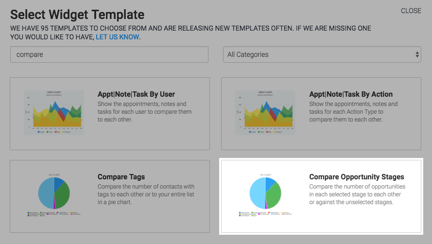
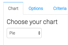
Chart Tab
The only chart type is Pie.
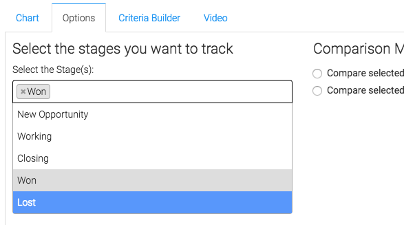
Options Tab
Now navigate to the Options tab and select which stages you would like to track.
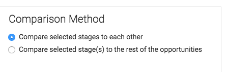
The select how you would like to compare the stages.
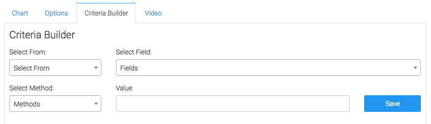
Criteria Builder Tab
For ultimate control and customization, use the Criteria Builder to include additional rules and requirements to the report.
Once you have your everything set, click Save Preferences on This Widget.
Relevant Articles
- How to Configure the Compare Tags Report
- Calculating RFM (Recency, Frequency, Monetary)
- How to Configure the Opportunity Stage Goal Report
Try Graphly for Just $1!
Unlock the full potential of your data with Graphly! Sign up for our 14-day trial for only $1 and gain access to a wide range of powerful reports designed to help you make data-driven decisions. Here are some of the reports you can explore:
- Opportunity Leaderboard: Track and analyze your team’s performance.
- Gross Revenue: See the money coming into your Keap account over time.
- Opportunity Forecast: Forecast the adjusted revenue of active opportunities based on the stage probability.
- Units Sold: See the number of units sold for each product you select over a given date range.
- Campaign Email Stats: Measure the impact and conversion of your marketing campaigns.
- Tags Applied: See how many tags get applied to contacts during a period of time.
Don’t miss out on this limited-time offer! Start Your 14-Day $1 Trial Now.