The Pipeline Digression template shows backwards movement of opportunities in the sales process, giving you an idea of which leads may need extra attention.
Display Tab
The Chart tab is where the appearance settings of the report live.
Under Chart Type, you can choose to view the report as a column or bar chart.

Under miscellaneous, click on Show Total Opportunities Digressed and Show Total Digressions to Opportunities to display them on the top right corner of the chart.

Settings Tab
In the Settings tab you will define the specifics of the report, and what data it will contain.
Select the open stages you wish to track.

Select the date range you wish to see for the generated results.

Now select how you would like the digression displayed by clicking Sales Stage, Sales Rep, or None.

Display Tab
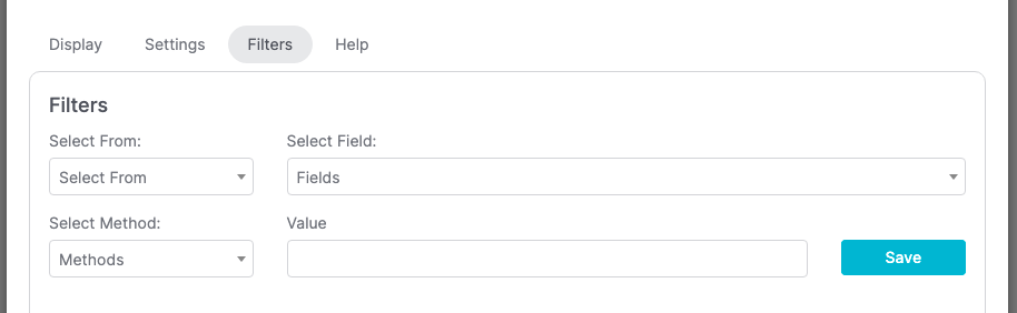
For ultimate control and customization click the Filters tab. The Filters allow you to segment the results by a field or tag value, allowing you to get hyper-specific results.
Relevant Articles
- How to Configure an Opportunity Attribution Report
- How to Configure an Opportunity Pipeline Summary Report
- How to Configure a Days Between Contact and Opportunity Report
Try Graphly for Just $1!
Unlock the full potential of your data with Graphly! Sign up for our 14-day trial for only $1 and gain access to a wide range of powerful reports designed to help you make data-driven decisions. Here are some of the reports you can explore:
- Opportunity Leaderboard: Track and analyze your team’s performance.
- Gross Revenue: See the money coming into your Keap account over time.
- Opportunity Forecast: Forecast the adjusted revenue of active opportunities based on the stage probability.
- Units Sold: See the number of units sold for each product you select over a given date range.
- Campaign Email Stats: Measure the impact and conversion of your marketing campaigns.
- Tags Applied: See how many tags get applied to contacts during a period of time.
Don’t miss out on this limited-time offer! Start Your 14-Day $1 Trial Now.