This template displays the number of tags within a group that get applied to contacts during a sale period.
Display Tab
Chart Type
Select your chart type. If you want the data stacked, check the Stacked box.

Miscellaneous
By clicking the Show Total Number box, the total number of tags applied to the contact will be displayed in the top right hand corner of the chart.

Settings Tab
Tag Grouping
Now navigate to the Settings tab and create a new group by typing its name into the box and clicking the add icon.

From here add tags to the Groups you make by clicking on Add tag to this group and typing in the name of the tag. Then click Add. You can add multiple tags to multiple groups, and change the order of the groups by clicking and dragging them. If a group name is too long, you can click on the pencil icon and edit it.

Date Range
Now select your date range.

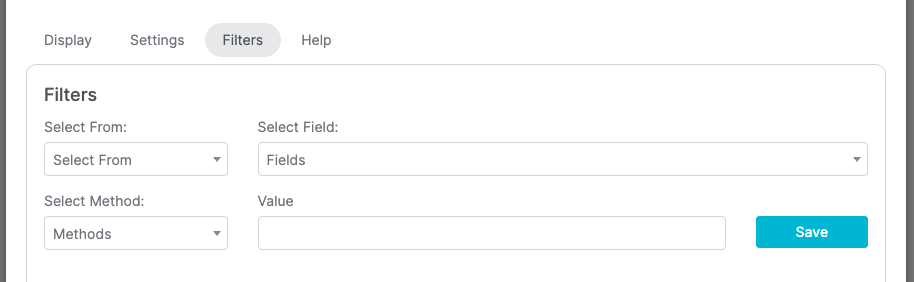
Filters Tab
For ultimate control and customization, use Filters to include additional rules and requirements to the report.
Relevant Articles
- How to Set Up the Grouped Tags Funnel Report
- How to Configure the Tags Applied Report
- How to Set Up the Compare Tags Report
Try Graphly for Just $1!
Unlock the full potential of your data with Graphly! Sign up for our 14-day trial for only $1 and gain access to a wide range of powerful reports designed to help you make data-driven decisions. Here are some of the reports you can explore:
- Opportunity Leaderboard: Track and analyze your team’s performance.
- Gross Revenue: See the money coming into your Keap account over time.
- Opportunity Forecast: Forecast the adjusted revenue of active opportunities based on the stage probability.
- Units Sold: See the number of units sold for each product you select over a given date range.
- Campaign Email Stats: Measure the impact and conversion of your marketing campaigns.
- Tags Applied: See how many tags get applied to contacts during a period of time.
Don’t miss out on this limited-time offer! Start Your 14-Day $1 Trial Now.