The Email Reach report shows the number and percentage of marketable email addresses in the last 6 months.
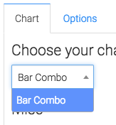
Chart Tab
From the Chart Tab you’ll see this report is displayed in a Bar Combo.
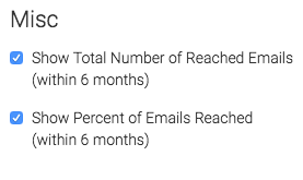
We have the ability to show the total number and/or the percentage of emails reached in the last 6 months by checking these boxes.
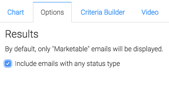
Options Tab
Now let’s head over to the Options Tab, by default this report will only take into account email statuses that are marketable.
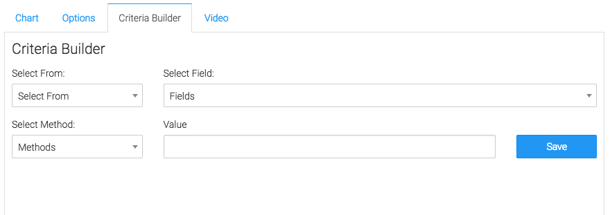
Criteria Builder Tab
To add additional specifications to your report use the Criteria Builder.
Relevant Articles to Email Reach
- Setting Up Email Reporting in Keap’s Campaign Builder
- How to Set Up the Email Service Provider Breakdown Report
- How to Set Up the Aging Email Addresses Report
Try Graphly for Just $1!
Unlock the full potential of your data with Graphly! Sign up for our 14-day trial for only $1 and gain access to a wide range of powerful reports designed to help you make data-driven decisions. Here are some of the reports you can explore:
- Opportunity Leaderboard: Track and analyze your team’s performance.
- Gross Revenue: See the money coming into your Keap account over time.
- Opportunity Forecast: Forecast the adjusted revenue of active opportunities based on the stage probability.
- Units Sold: See the number of units sold for each product you select over a given date range.
- Campaign Email Stats: Measure the impact and conversion of your marketing campaigns.
- Tags Applied: See how many tags get applied to contacts during a period of time.
Don’t miss out on this limited-time offer! Start Your 14-Day $1 Trial Now.