This template gives you clarity into how much value per lead is created x number of days after a tag has been applied to the contact record.
Setting Up the Value Per Lead by Tag Report
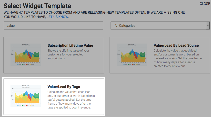
To begin, click the “+” icon on the Dashboard and type “value” into the search bar. Then select the “Value/Lead By Tags” template.
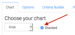
Under the Chart tab, you’ll see that there are four chart types available. We’ve selected the Area type. You also have the option to stack the data by checking the Stacked box.
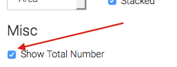
Check the “Show Total Number” box to show the two averages, measured in dollars, in the top right-hand corner of the report.
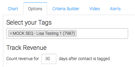
Click on the “Options” Tab and select the tags which you wish to measure, and select how long you would like to track revenue.
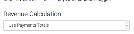
Next, determine how you want to calculate your revenue.
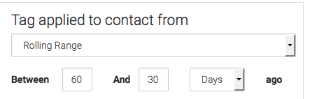
Next, you need to tell Graphly when you want to begin counting data, meaning, when the tag was applied to the data.
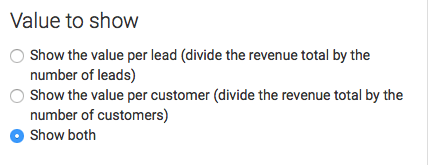
Then select the value to show. There are three options: Show the value per lead, Show the value per customer, or Show both.
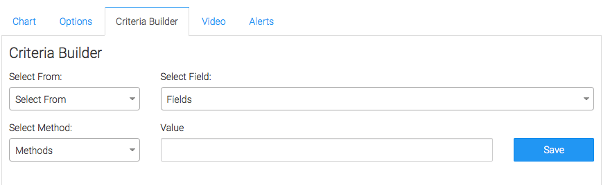
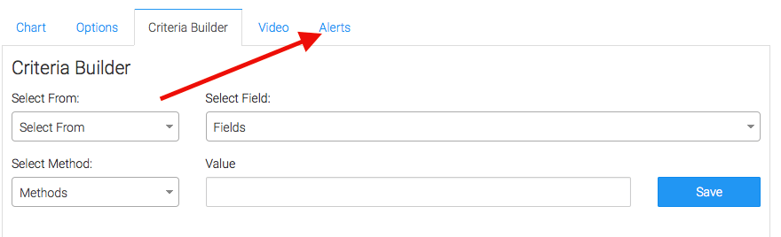
Criteria Builder and Alerts
For ultimate control and customization, use the “Criteria Builder” to include additional rules and requirements to the report. Using this, you can filter your results by any field in the contact record.
Lastly, feel free to set alerts in the Alerts tab for if your values rise above, or fall below a threshold of your choosing.
Once you have your alerts set, click “Save Preferences” on This Widget.
Relevant Articles
Try Graphly for Just $1!
Unlock the full potential of your data with Graphly! Sign up for our 14-day trial for only $1 and gain access to a wide range of powerful reports designed to help you make data-driven decisions. Here are some of the reports you can explore:
- Opportunity Leaderboard: Track and analyze your team’s performance.
- Gross Revenue: See the money coming into your Keap account over time.
- Opportunity Forecast: Forecast the adjusted revenue of active opportunities based on the stage probability.
- Units Sold: See the number of units sold for each product you select over a given date range.
- Campaign Email Stats: Measure the impact and conversion of your marketing campaigns.
- Tags Applied: See how many tags get applied to contacts during a period of time.
Don’t miss out on this limited-time offer! Start Your 14-Day $1 Trial Now.