The Hourly Order Activity template shows the Time of day the orders are created.
Search for the Hourly Order Activity
To begin, click the “+” icon on the Dashboard and type “Hourly Order Activity” into the search bar. Then select the template.
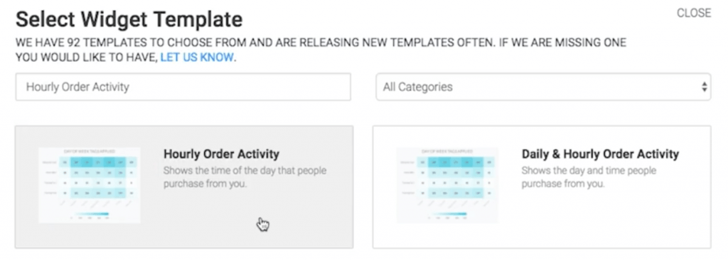
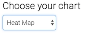
Chart Tab
The only chart type here is Heat Map.
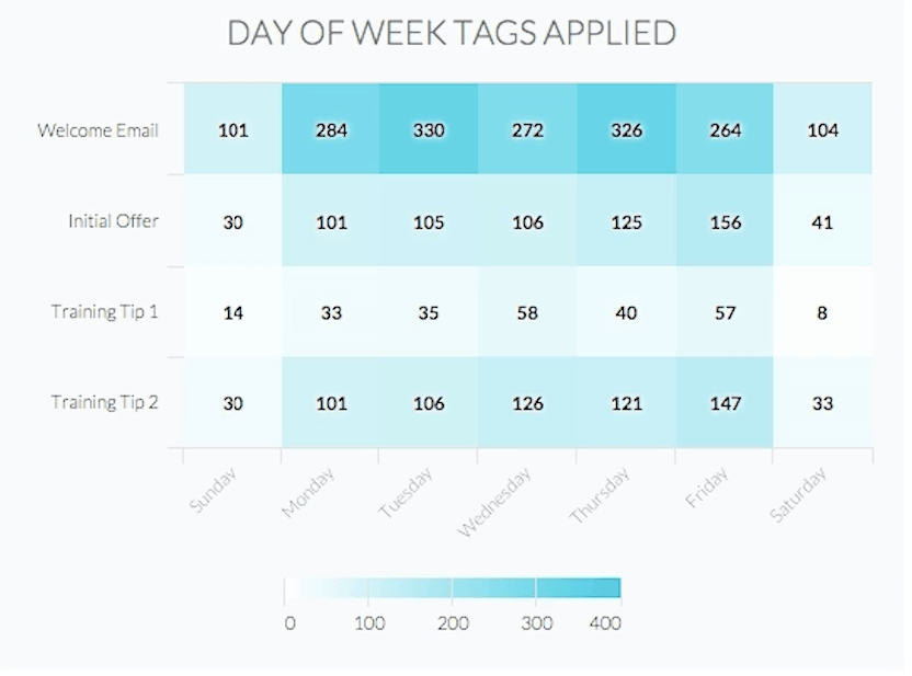
A darker section of the heat map shows more tags being applied, and a lighter section of the heat map shows less tags being applied.
Options Tab
First, you need to select the value you would like to display in each box.
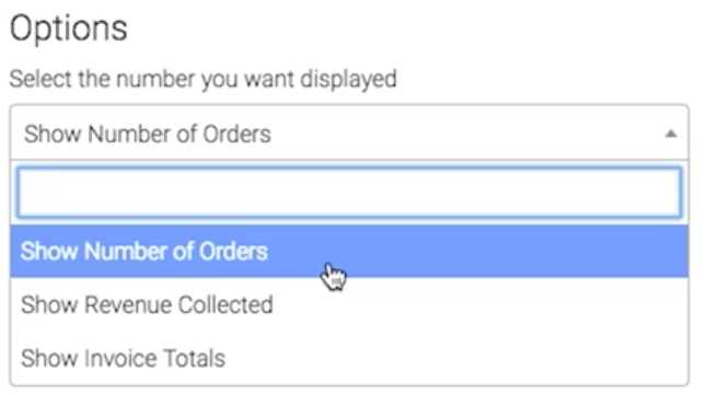
NOTE: When choosing on option that will display a dollar amount, the heat map will require more horizontal space on your dashboard.
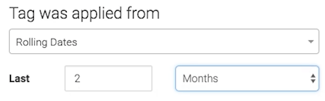
Now select the date range you wish to measure.
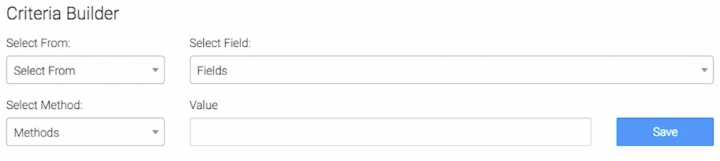
Criteria Builder Tab
For ultimate control and customization, use the Criteria Builder to include additional rules and requirements for the report.
When finished, press the blue button at the bottom to save your preferences for this widget.

Relevant Articles
- How to Configure the Daily & Hourly Email Engagement Report
- How to Configure the Daily & Hourly Order Activity Report
- How to Set Up the Campaign Email Stats Report
Try Graphly for Just $1!
Unlock the full potential of your data with Graphly! Sign up for our 14-day trial for only $1 and gain access to a wide range of powerful reports designed to help you make data-driven decisions. Here are some of the reports you can explore:
- Opportunity Leaderboard: Track and analyze your team’s performance.
- Gross Revenue: See the money coming into your Keap account over time.
- Opportunity Forecast: Forecast the adjusted revenue of active opportunities based on the stage probability.
- Units Sold: See the number of units sold for each product you select over a given date range.
- Campaign Email Stats: Measure the impact and conversion of your marketing campaigns.
- Tags Applied: See how many tags get applied to contacts during a period of time.
Don’t miss out on this limited-time offer! Start Your 14-Day $1 Trial Now.