The Subscription Cancellations template shows the number of subscriptions that are canceled or inactivated for a given time frame.
Search for the Report
To begin, click the “+” icon on your Dashboard and type “subscription” in the search bar. Then click on the “Subscription Cancellations” template.
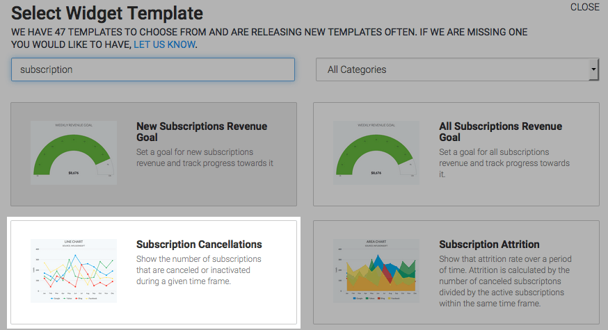
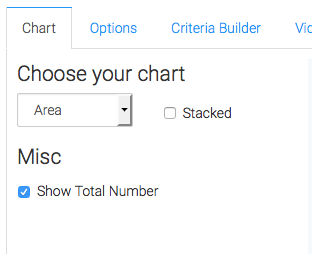
Chart Tab
Graphly defaults to the Area chart type. Because you’re graphing just a single data point, stacking has no bearing on this report. Check the Show Total Number box to show the total in the top right-hand corner of the graph.
Options Tab
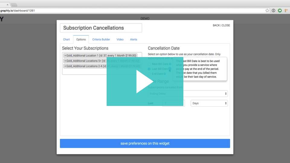
Subscriptions
Next, navigate to the Options Tab and select your subscriptions. Choosing more than one subscription plan joins the data into a single column, bar, or line.
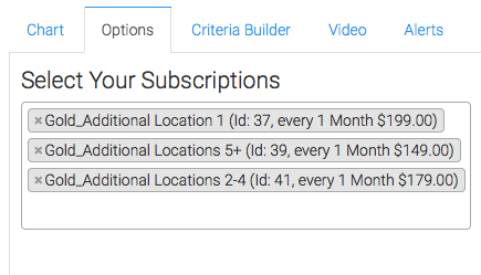
If you want to compare one subscription plan to another, you must use two separate widgets to do so.
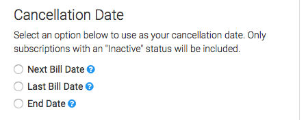
Cancellation Date
Next, define your cancellation date. Your options are Next Bill Date, Last Bill Date, and End Date.
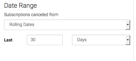
Date Range
Next, set your date range.
Criteria Builder Tab
For ultimate control and customization, use the Criteria Builder to include additional rules and requirements to the report.
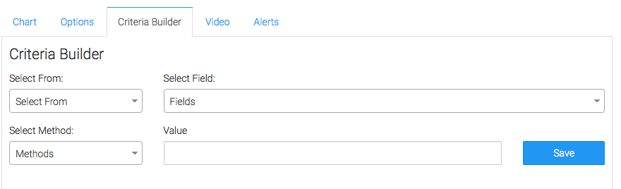
Once you have your criteria set, click Save Preferences on This Widget.
Relevant Articles
- How to Configure the Subscription Stick Rate Report
- How to Set Up the Average Subscription Price Report
- How to Set Up the Lifetime Value Report
Try Graphly for Just $1!
Unlock the full potential of your data with Graphly! Sign up for our 14-day trial for only $1 and gain access to a wide range of powerful reports designed to help you make data-driven decisions. Here are some of the reports you can explore:
- Opportunity Leaderboard: Track and analyze your team’s performance.
- Gross Revenue: See the money coming into your Keap account over time.
- Opportunity Forecast: Forecast the adjusted revenue of active opportunities based on the stage probability.
- Units Sold: See the number of units sold for each product you select over a given date range.
- Campaign Email Stats: Measure the impact and conversion of your marketing campaigns.
- Tags Applied: See how many tags get applied to contacts during a period of time.
Don’t miss out on this limited-time offer! Start Your 14-Day $1 Trial Now.