This template shows the stick rate of existing customers who started the date range with an active subscription.
Chart Tab
Display Type
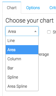
From the chart tab, you’ll see there are various chart options. You can choose from Line, Area, Column, Bar, Spline and Area Spline. This only affects how the report displays, and doesn’t affect the data in any way.
Miscellaneous
Below the chart type, we have the ability to show the overall average by checking the Show Overall Average box. This will display the average retention rate for the date range in the top right-hand corner of the report.

Options Tab
Now let’s go to the Options tab.
Subscription
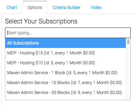
First, we’ll select the subscription we would like to measure. You can select All Subscription is you want to measure the Stick Rate across your entire Keap Application.
Cancellation Date
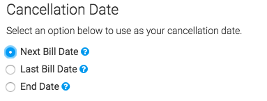
Next, select the cancellation date. You would want to use Next Bill Date if your customers pay for services in advance. Last Bill Date is for if customers pay for your service only after receiving the service for the billing period. You will only want to select End Date if you are manually entering the End Date in the subscription when a customer cancels.
Date Range
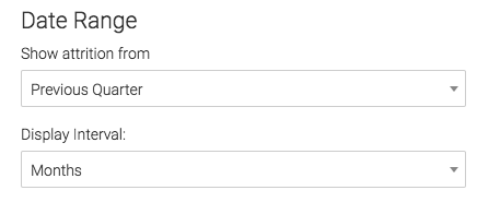
Lastly, select the date range. There are dozens of options to choose from here, so choose the range that best suites your needs. The Display Interval can be set to Days, Weeks, or Months. Typically, larger date ranges will look best in months, while smaller date ranges look best in Days or Weeks.
Criteria Builder Tab
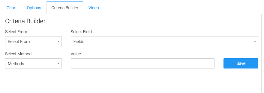
For ultimate control and customization, use the Criteria Builder. Think of the Criteria Builder as a Filter. For example, if you wanted to Display the Subscription Stick Rate across your Keap account, but only for those that have the Member tag, you could set the Criteria Builder like this:
Select From: Contacts >> Select Field: Tags >> Select Method: Contains Any >> Value: Member
Simplified, this would look like:
Select from Contacts who’s Tags Contain the Member tag.
Make sure to click the Save Preferences button down at the bottom of the configuration window.
Congratulations, you have configured the Subscription Stick Rate report.
Relevant Articles
- How to configure the Subscription Stick Rate by Age Report
- How to configure the Subscription Attrition Report
- How to Configure the Subscriptions Started Report
Try Graphly for Just $1!
Unlock the full potential of your data with Graphly! Sign up for our 14-day trial for only $1 and gain access to a wide range of powerful reports designed to help you make data-driven decisions. Here are some of the reports you can explore:
- Opportunity Leaderboard: Track and analyze your team’s performance.
- Gross Revenue: See the money coming into your Keap account over time.
- Opportunity Forecast: Forecast the adjusted revenue of active opportunities based on the stage probability.
- Units Sold: See the number of units sold for each product you select over a given date range.
- Campaign Email Stats: Measure the impact and conversion of your marketing campaigns.
- Tags Applied: See how many tags get applied to contacts during a period of time.
Don’t miss out on this limited-time offer! Start Your 14-Day $1 Trial Now.